
Project Images


Description
Dolleruper Destille produces premium spirits in the far North of Germany, near the Danish border. In 2024, a new brand identity was created for the distillery as part of the Master’s program “Design, Film & Marketing”. I developed the brand design shown here together with three fellow students. Our concept prevailed over those of the other teams in the course and was chosen as the winning design. For economic and organizational reasons on the client’s side, it was never implemented, so the project should be seen as conceptual work.
All good things come in threes
Dolleruper Destille is an exciting brand that positions itself in the spirits market in several ways. It presents itself as a traditional brand with the utmost respect for the classic crafts of brewing and distilling. At the same time, Dolleruper Destille is proud of its roots and visibly communicates this regional aspect. Last but not least, Dolleruper Destille stands for sustainable organic products and cultivates a premium, exclusive brand image.
The brand design we developed aims to bring these different positions into harmony and make them visually tangible. To achieve this, we came up with one idea … or rather, three!
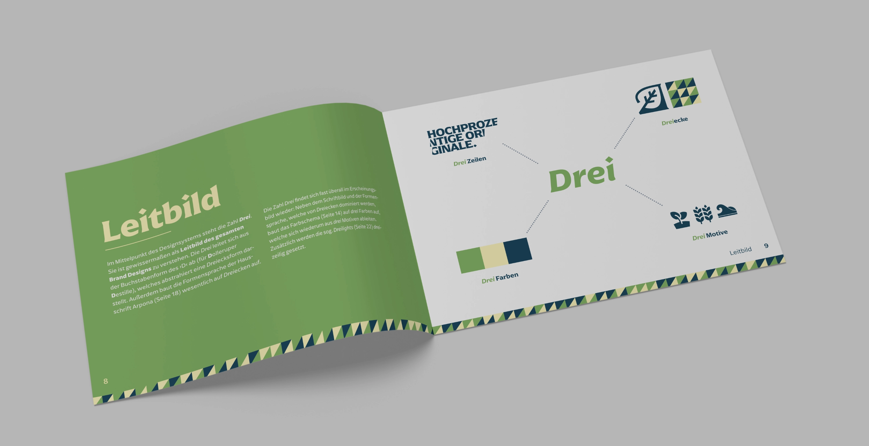
At the heart of the design system is the number three. It can be understood as the guiding principle of the entire brand design. The three is derived from the shape of the letter ‘D’ (for Dolleruper Destille), which, when abstracted, forms a triangle. In addition, the shapes of the brand typeface Arpona are largely built on triangles.
The number three can be found almost everywhere in the brand identity: Besides the typography and visual language, which are dominated by triangles, the color scheme is based on three colors, which in turn are derived from three motifs: land, coast and sea. Headlines are also distinctively set in three lines.


