
Project Images


Description
Software today is expected to do it all: work seamlessly on both smartphones and computers, be accessible to everyone, and look good at the same time. Big tech companies like Google or Microsoft tackle this challenge with so-called design systems – a kind of toolkit with reusable design elements and clear rules that guide all teams during product development.
But what about small companies? lambda9 from Flensburg, a small corporation with around 30 employees, develops digital products for everyday office tasks – from electronic document signing to time tracking. Until recently, development had taken place without a unified system, which led to visual inconsistencies across different products over the years.
In my master’s thesis in the “Design, Film & Marketing” program at Flensburg University of Applied Sciences, I explored how small companies with limited resources can still develop an effective design system. To do this, I first analyzed existing systems and then created a tailored concept for lambda9. The outcome was tested both by potential users for acceptance and by the company’s developers for technical feasibility.
The conclusion: Design systems are worthwhile even for small companies – but they need to be planned early, kept manageable in scope, and aligned with established UI conventions. The key lies in adapting the system to available resources: often, a simple style guide and a lean component library are enough to create consistent, brand-appropriate software.
The development process
The first step in creating the design system was to capture the status quo: a so called interface inventory was conducted to document all recurring elements across the three software products – from buttons and navigation bars to color usage. This analysis revealed significant inconsistencies: the products used different visual styles for identical functions, mixed icon sets, applied an inconsistent color scheme with too many variations, and were not optimized for mobile devices, as the following image shows:
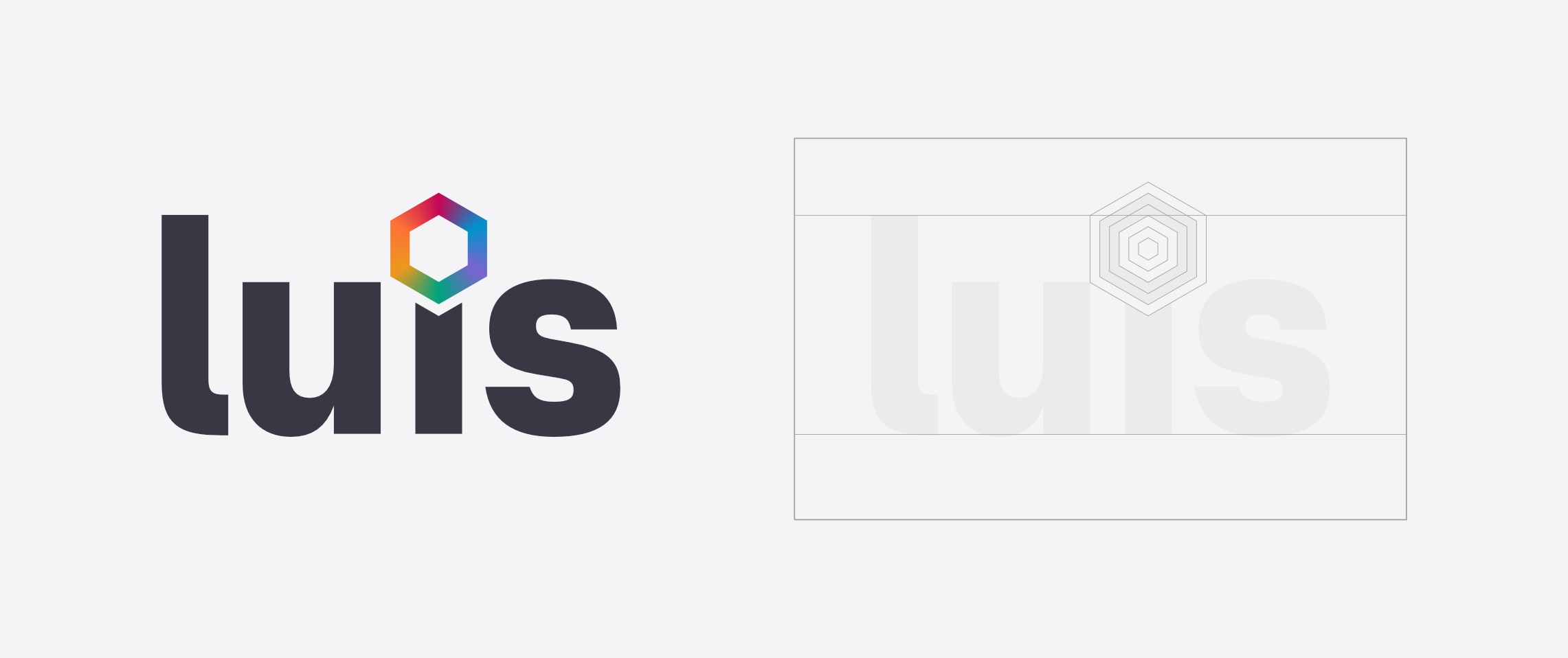
From these findings, three design principles were derived: “Clarity before cleverness” (clear, straightforward design), “The user feels at home” (familiar, welcoming interfaces), and “The product adapts to the user” (responsive design and accessibility). The design system was also given a memorable name: luis, short for lambda user interface system.
These principles became the foundation for the system’s visual building blocks: a reduced color palette with just four primary colors in light and dark variants, a visual language featuring subtly rounded corners and generous spacing, consistent use of lambda9’s main typeface Supreme in three weights, and a unified icon set.
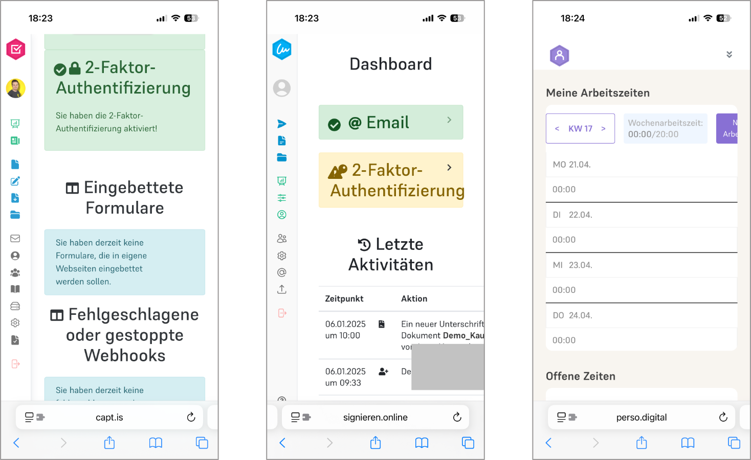
Putting the system to the test
Based on these visual building blocks, components were developed following the principle of Atomic Design: from simple elements like buttons and input fields, to more complex molecules like forms and dialogs, all the way up to full page structures. For each of the three products, example user interfaces were created in both mobile and desktop views to demonstrate how a redesign with the design system could look (see images above). Evaluation with 102 respondents delivered clear results: over 80 % preferred the redesign, and 87 % rated the three products as visually consistent. The designs were perceived as appealing, professional, and intuitive.
Three expert interviews with lambda9 developers confirmed technical feasibility and highlighted the benefits of more efficient development processes. The biggest challenge is rolling it out across existing products; for new developments, introducing the system would be much easier. The systematic approach and reusability of components were praised by all three interviewees.


